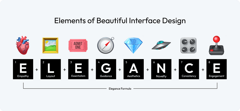
Crafted to be your ultimate roadmap in the journey of UI design. Whether you are a seasoned designer looking to refresh your approach or a novice eager to learn the ropes, these rules are tailored to help you create interfaces that are not just visually appealing but also intuitively functional. To navigate this complex terrain, I have compiled 58 rules across eight categories, collectively forming the “Elegance Formula” for user interface design.
🫀Empathy:There is no universal concept of beauty; only when you truly understand your target audience can you create a design that is appealing to them.
🖼️Layout:The layout is the canvas of your interface; it should guide the user’s eye effortlessly, creating a seamless flow that intuitively connects each element.
🎟Essentialism:Embrace simplicity; every element in your design should serve a purpose, as clutter can obscure the message and hinder the user experience.
🧭Guidance:Design should not just please the eye but also lead the user, providing clear pathways and cues for what they should do next.
💎Aesthetics:Aesthetics go beyond mere appearance; they encapsulate the feel of the design, creating an environment that resonates emotionally with the user.
🛸Novelty:Innovative designs capture attention, but the true art lies in balancing novelty with familiarity, ensuring users feel intrigued yet comfortable.
🎛Consistency:Consistency in design breeds familiarity; it ensures the user feels at home across various parts of your interface, building trust and ease of use.
🕹Engagement:An engaging design is like a good conversation; it keeps the user interested, responds to their actions, and encourages them to come back for more.
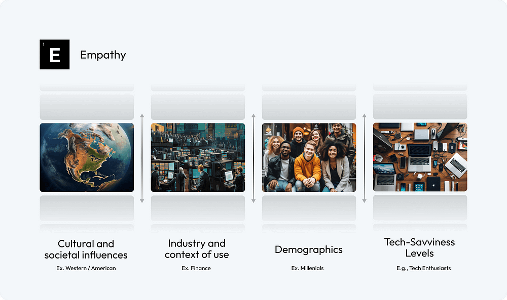
Cultural and societal influences play a crucial role in shaping preferences and perceptions
1.Consider Cultural and Societal Influences:Factor in the diverse cultural and societal backgrounds of your audience to ensure your design resonates broadly and respectfully.
2.Understand Industry and Context of Use:Tailor your design to align with the specific industry norms and the practical context in which your interface will be used.
3.Embrace User Demographics:Embrace the diversity in user demographics, incorporating insights about age, gender, profession, and other factors to craft a more tailored and effective interface.
4.Adapt to Your Audience’s Tech-Savviness:Customize your interface to suit the specific tech-savviness level of your target audience
The Nielsen Norman Group’s research across different demographics — highlighting the unique online behaviors and expectations ofyoung adults, the evolving digital literacy and specific usability needs ofseniors, and the distinct and varyingdesign requirements for children— emphasizes the critical importance of empathetic and user-centric design in user interface development to cater effectively to each group’s unique characteristics and preferences.
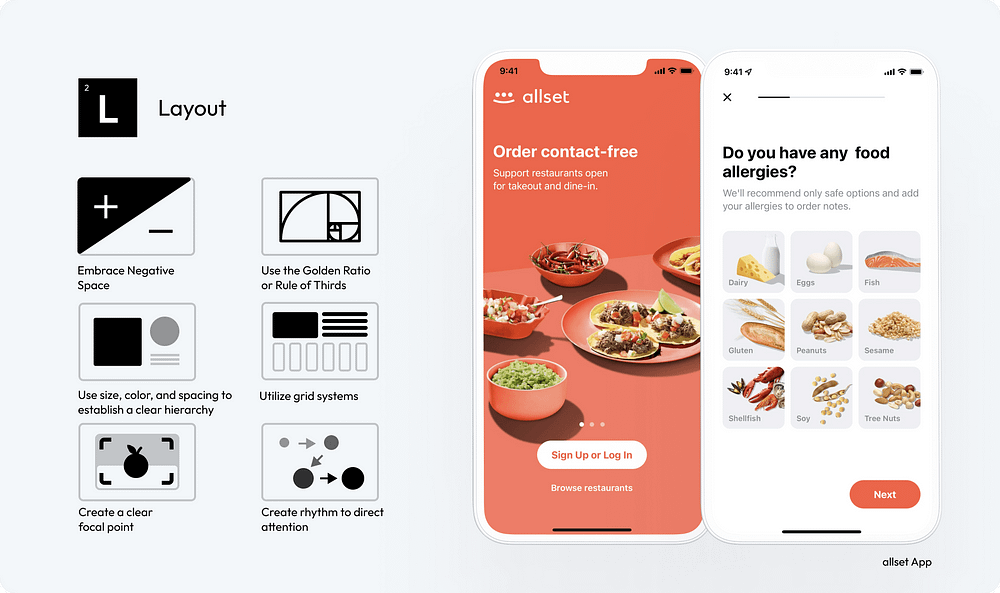
A well-planned layout is not just about placing elements on a screen; it’s about creating a visual symphony that directs, delights, and engages users
5.EmbraceNegative Space:Use negative space wisely to create a clean, uncluttered interface that highlights the most important elements and improves readability.
6.Use theGolden RatioorRule of Thirds:Incorporate the Golden Ratio or the Rule of Thirds in your design to achieve natural balance and aesthetically pleasing proportions.
7.Establish a Clear Hierarchy with Size, Color, and Spacing:Utilize variations in size, color, and spacing to create a visual hierarchy that guides the user’s eye to the most significant information first.
8.UtilizeGrid Systems:Implement grid systems to bring structure and consistency to your layout, ensuring a cohesive and harmonious arrangement of elements.
The welcome screen of the Allset app skillfully utilizes the Z-pattern layout to create rhythm and direct the user’s attention to the ‘Sign Up’ or ‘Log In’ button. By employing grid systems and ample negative space, the design presents multiple options in a manner that is clear and not overwhelming, effectively balancing information display with visual ease.
9.Create a ClearFocal Point:Designate a clear focal point in your layout to capture immediate attention and orient the user’s interaction with your content.
10.Create Rhythm to Direct Attention:Employ rhythmic design elements, such as repeated patterns or structured layouts, to create a visual flow that intuitively directs the user’s attention through the interface.
In addition, consider utilizingF and Z-pattern layoutsto match users’ natural scanning habits. Employ the F-pattern in text-dense interfaces, strategically placing crucial information at the top and left.
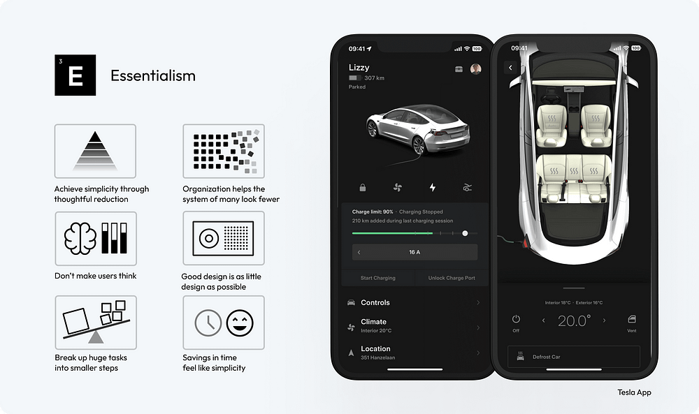
Simplicity is ultimate sophistication
It’s about stripping away the non-essential elements and focusing on what truly matters to the user.
11.Achieve Simplicity ThroughThoughtful Reduction:Prioritize content and features, removing anything non-essential. Focus on the core functionalities to create a streamlined and more user-friendly interface.
12.Organization Helps the System of Many Look Fewer:Use clear categorization and grouping of elements. Implement drop-down menus or tabs to organize content, making the interface less cluttered and more navigable.
13.Don’t Make Users Think:Ensure that navigation and task flows are logical and predictable. Use common UI elements and place them where users expect them to be, reducing cognitive load.
14.Good Design is as Little Design as Possible:Adopt a minimalist approach, using only elements that are necessary for functionality. Avoid excessive use of colors, fonts, and graphics to maintain a clean and focused interface.
The Tesla App is evidently designed with a focus on minimalism and enduring design aesthetics. This is primarily achieved through the reduction of components and labels. The interface avoids the use of intrusive styles and instead, it employs a digital representation of the car itself as the main visual element.
15.Break Up Huge Tasks into Smaller Steps:Design complex processes, like forms or multi-step tasks, into smaller segments. Use progress bars or breadcrumbs to visually indicate the user’s progress and what remains.
16.Savings in Time Feel Like Simplicity:Optimize load times and streamline processes to make interactions quicker. Use smart defaults, autocomplete features, and predictive text to speed up user input and decision-making.
It’s not just about leading the user from point A to point B; it’s about creating a journey that feels natural, effortless, and engaging
The art of designing a user interface involves guiding the user through a digital landscape with intuition and ease.
17.Craft Engaging User Onboarding: Start by designing an engaging onboarding process that educates users about your product from the first interaction. Effective onboarding lays the foundation for the user’s entire experience with your interface.
18.Ensure an Intuitive Flow: Develop your interface with a logical, step-by-step flow that feels natural and requires minimal effort for users to navigate, enhancing their overall experience.
19.OfferContextual Hints and Tips: Implement contextual assistance such as tooltips, pop-ups, or inline instructions that appear when users need them, aiding in their understanding and use of the interface.
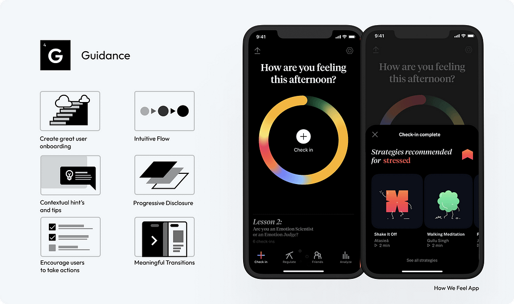
The engaging onboarding process of the ‘How We Feel’ app allows users to immediately grasp the value of the product. Helpful tips and guided recommendations are tailored based on the user’s current feelings, fostering a sense of control and intuitiveness in the user experience.
20.ImplementProgressive Disclosure: Strategically reveal information to users, showing only what’s necessary at each step. This approach helps maintain a clean interface and focuses the user’s attention on immediate tasks.
21.Design to Encourage User Actions: Use clear design elements like buttons, icons, and calls to action to guide users towards desired interactions, ensuring these elements are prominent and easily accessible.
22.Provide Feedback for User Actions:Create a system that offers immediate visual or auditory feedback for user actions, acknowledging their interactions and guiding them to the next step in the interface.
Masterfully applied typography helps you stand out, enhance readability and aesthetic appeal
23.EstablishTypography Hierarchy: Create a clear hierarchy using different font sizes, weights, and styles to guide the user’s attention to the most important content first.
24.Prioritize Readability: Choose fonts that are easy to read on various devices and screen sizes. Legibility should be a top priority, especially for body text.
25.Reflect Brand Mood: Select fonts that align with your brand’s personality. Whether it’s professional, playful, or elegant, typography should reinforce the brand’s tone.
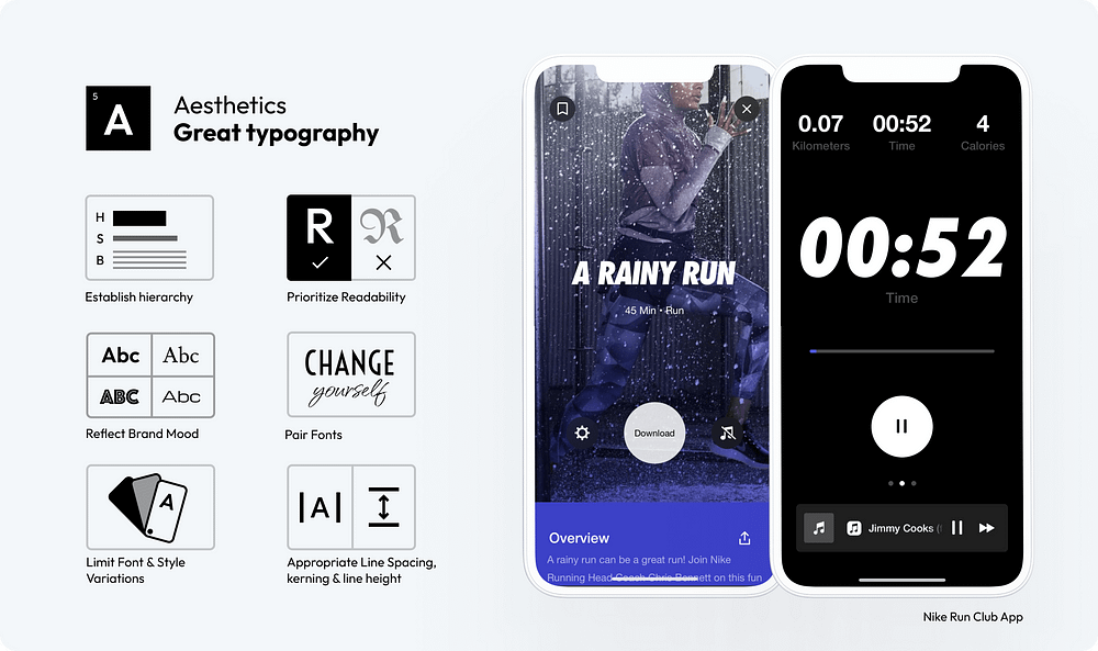
The Nike Run Club App skillfully employs bold, italic typography as its main focus, evoking a sense of movement and uniqueness without overwhelming, thanks to its sparing use alongside a neutral body font
26.Pair Fonts Wisely: When combining multiple fonts, ensure they complement each other.
27.Limit Font and Style Variations: Too many font types or styles can create a cluttered and confusing interface. Stick to a limited set to maintain a clean and cohesive look.
28.AdjustLine Spacing, Kerning, and Line Height: Proper spacing between letters (kerning), words, and lines improves readability and text flow. Experiment with different settings to find the most visually appealing and readable format.
The right color choices can make a significant difference in how users perceive and interact with a product
29.Contrast is Key:Ensure sufficient contrast between text and background to enhance readability and accessibility.
30.Create and Use a Consistent Color Palette:Develop a consistent color palette that reflects your brand identity and use it consistently across your interface to maintain visual coherence.
31.Use the60–30–10 rulefor balancing colors: — 60% dominant color, 30% secondary color, and 10% accent color, to create a visually harmonious interface.
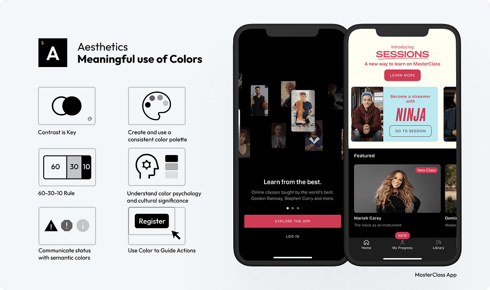
The MasterClass app serves as an exemplary model for the application of the 60–30–10 rule in design, showcasing how this principle can be effectively utilized to enhance user interface aesthetics and functionality.
32.Understand Color Psychology andCultural Significance: Consider how different colors evoke different emotions and meanings in various cultures. Tailoring your color choices to your audience can enhance the user experience and avoid cultural missteps.
33.Communicate Status with Semantic Colors:Use colors to communicate status intuitively, like red for errors or green for success, to help users understand system feedback quickly.
34.Use Color to Guide Actions: Utilize color strategically to highlight key actions, like buttons or links, guiding the user’s attention to important interactions.
Effective visual content in UI design enhances user engagement and emotional connection
35.Prioritize Content Over Excessive UI Styling: Focus on delivering content through visuals without overwhelming the user with excessive UI decorations. Let the visuals speak for themselves.
36.Purposeful Imagery and Illustrations: Use imagery and illustrations that add meaning to your content. Avoid generic stock photos; opt for custom or carefully selected images that reflect the brand’s identity and message.
37.Keep Text Concise and Straightforward: Complement visuals with clear and concise text. Avoid long paragraphs and opt for bullet points or short descriptions that enhance the visual message.
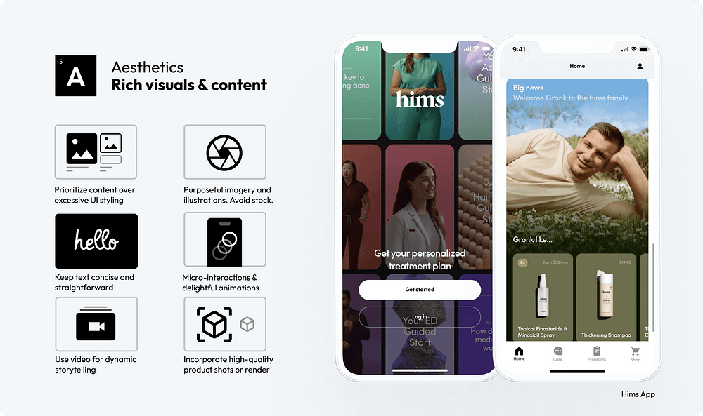
The Hims app distinguishes itself with a content-first approach, minimizing the reliance on complex UI styling. It employs high-quality visuals, including well-curated photos and short videos, that are consistent with the app’s mood and style, contributing to a cohesive and user-friendly interface.
38.Micro-Interactions & Delightful Animations: Incorporate subtle animations and micro-interactions that enhance user engagement without detracting from the main content.
39.Use Video for Dynamic Storytelling: Implement video content to tell stories or explain complex concepts dynamically. Videos can be particularly effective in conveying messages that are difficult to express through static images.
40.Incorporate High-Quality Product Shots or Renders: For e-commerce and product-based interfaces, use high-quality photographs or 3D renders of products. Detailed and attractive product visuals can significantly boost user interest and sales.
Innovative or unique interfaces will create memorable experiences, leading to higher user satisfaction.
41.Strive for Originality and Uniqueness:Create UI designs that stand out with original concepts and unique elements, differentiating your product in a crowded market.
42.Leverage the Latest Technology:Stay abreast of emerging technologies and consider how they can be incorporated into your design to offer cutting-edge experiences.
43.Be theMost Advanced, Yet Acceptable:Push the boundaries of innovation, but ensure your designs remain user-friendly and accessible to your target audience.
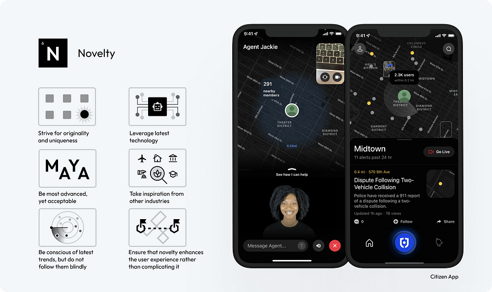
Citizen’s personal safety network empowers users to protect themselves and their communities. Its integration of a personal agent concept is both innovative and user-friendly, offering a novel yet logical enhancement to the experience.
44.Take Inspiration from Other Industries:Look beyond the field of UI design for inspiration, drawing creative ideas from art, architecture, nature, and more.
45.Be Conscious of Latest Trends, But Do Not Follow Them Blindly:Stay informed about current design trends, but use them judiciously to ensure your design maintains its unique identity.
46.Ensure that Novelty Enhances the User Experience Rather Than Complicating It:Novelty should always serve a purpose, enhancing the overall user experience without adding unnecessary complexity.
Consistency creates a sense of familiarity and helps build trust and confidence
47.Develop a Comprehensive Design System:A design system acts as a single source of truth for all design elements, ensuring uniformity across all aspects of the UI.
48.Limit Design Patterns:Using a consistent set of design patterns simplifies the user’s interaction model, making the interface more predictable and user-friendly.
49.Ensure Predictability in Element Behavior:Interface elements should behave consistently throughout the application, so users know what to expect from their interactions.
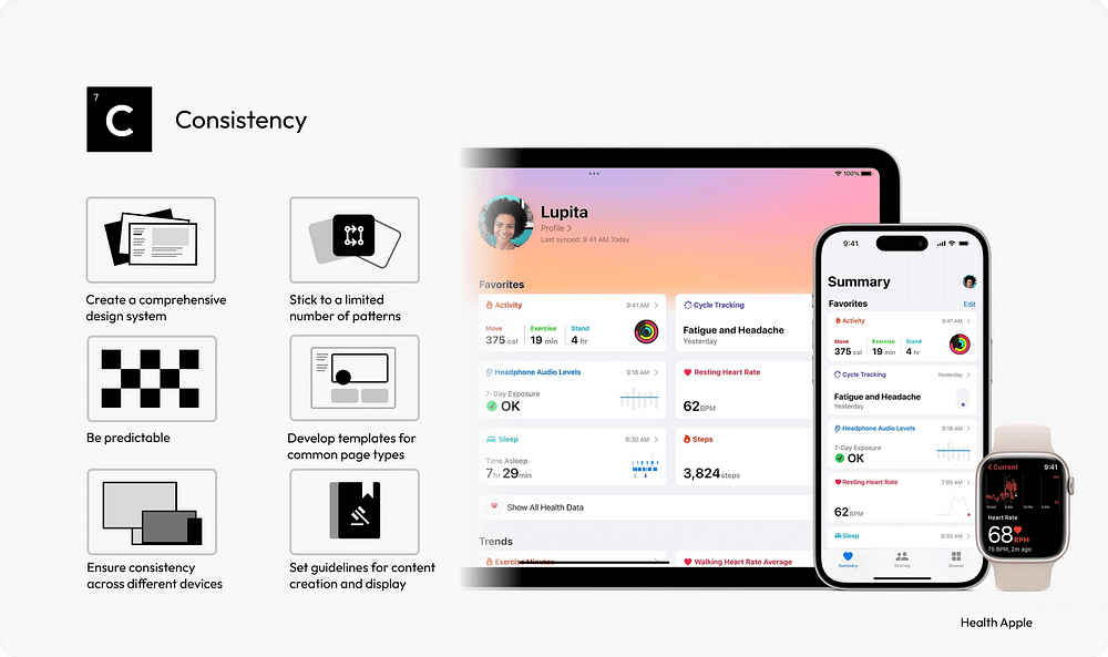
The Apple Health app serves as an exemplary model of consistent user experience across various devices. Its extensive library of components and templates ensures that new features and updates can be seamlessly integrated, maintaining ease of use and uniformity.
50.Use Standardized Templates:For common page types, standardized templates provide a consistent structure, aiding in user navigation and content comprehension.
51.Maintain Cross-Device Consistency:A consistent UI across different devices and platforms enhances the user experience, making the interface more approachable and accessible.
52.Standardize Content Guidelines:Consistent tone, style, and formatting in content presentation help maintain a coherent narrative across the interface.
Create a more immersive user experience that entertains
53.Introduce Gamification Elements:Incorporate game mechanics like points, badges, and leaderboards to motivate users and encourage interaction.
54.Personalization and Customization:Offer users the ability to customize their experience. Personalization can increase the relevance of the interface to the individual user, enhancing engagement.
55.UtilizeStorytellingTechniques:Embed narrative elements in the UI to create a more compelling and memorable user experience. Storytelling can guide users through the interface in an engaging way.
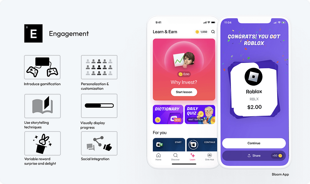
The Bloom App effectively incorporates gamification and educational components to assist investors in staying engaged and making well-informed investment decisions. An example of this is the offering of random gift stocks, a type of variable reward, which serves to create a sense of delight and surprise among users.
56.Visually Display Progress:Use visual indicators like progress bars to show users their achievements and progression. This can increase motivation and sense of accomplishment.
57.IncorporateVariable RewardMechanisms:Implement elements of surprise and delight, such as unexpected rewards or bonuses, to keep users engaged and curious.
58.Integrate Social Features:Include social integration features like sharing achievements or competing with friends to foster a sense of community and encourage continued engagement.
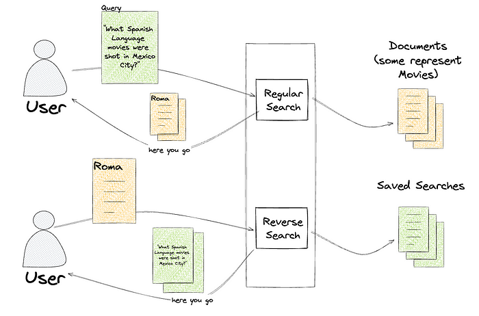
Since our previous posts regarding Content Engineering’s role in enabling search functionality within Netflix’s federated graph (the first post, where we identify the issue and elaborate on the indexing architecture, and the second post, where we detail how we facilitate querying) there have been significant developments. We’ve opened up Studio Search beyond Content Engineering to the entirety of the Engineering organization at Netflix and renamed it Graph Search. There are over 100 applications integrated with Graph Search and nearly 50 indices we support. We continue to add functionality to the service. As promised in the previous post, we’ll share how we partnered with one of our Studio Engineering teams to build reverse search. Reverse search inverts the standard querying pattern: rather than finding documents that match a query, it finds queries that match a document.
Intro Tiffany is a Netflix Post Production Coordinator who oversees a slate of nearly a dozen movies in various states of pre-production, production, and post-production. Tiffany and her team work with various cross-functional partners, including Legal, Creative, and Title Launch Management, tracking the progression and health of her movies.
So Tiffany subscribes to notifications and calendar updates specific to certain areas of concern, like “movies shooting in Mexico City which don’t have a key role assigned”, or “movies that are at risk of not being ready by their launch date”.
Tiffany is not subscribing to updates of particular movies, but subscribing to queries that return a dynamic subset of movies. This poses an issue for those of us responsible for sending her those notifications. When a movie changes, we don’t know who to notify, since there’s no association between employees and the movies they’re interested in.
We could save these searches, and then repeatedly query for the results of every search, but because we’re part of a large federated graph, this would have heavy traffic implications for every service we’re connected to. We’d have to decide if we wanted timely notifications or less load on our graph.
If we could answer the question “would this movie be returned by this query”, we could re-query based on change events with laser precision and not impact the broader ecosystem.
The Solution Graph Search is built on top of Elasticsearch, which has the exact capabilities we require:
percolator fields that can be used to index Elasticsearch queries percolate queries that can be used to determine which indexed queries match an input document.
Instead of taking a search (like “spanish-language movies shot in Mexico City”) and returning the documents that match (One for Roma, one for Familia), a percolate query takes a document (one for Roma) and returns the searches that match that document, like “spanish-language movies” and “scripted dramas”.
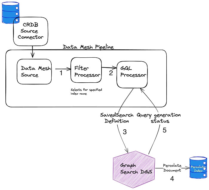
We’ve communicated this functionality as the ability to save a search, called SavedSearches, which is a persisted filter on an existing index.
type SavedSearch { id: ID! filter: String index: SearchIndex! } That filter, written in Graph Search DSL, is converted to an Elasticsearch query and indexed in a percolator field. To learn more about Graph Search DSL and why we created it rather than using Elasticsearch query language directly, see the Query Language section of “How Netflix Content Engineering makes a federated graph searchable (Part 2)”.
We’ve called the process of finding matching saved searches ReverseSearch. This is the most straightforward part of this offering. We added a new resolver to the Domain Graph Service (DGS) for Graph Search. It takes the index of interest and a document, and returns all the saved searches that match the document by issuing a percolate query.
""" Query for retrieving all the registered saved searches, in a given index, based on a provided document. The document in this case is an ElasticSearch document that is generated based on the configuration of the index. """ reverseSearch( after: String, document: JSON!, first: Int!, index: SearchIndex!): SavedSearchConnection Persisting a SavedSearch is implemented as a new mutation on the Graph Search DGS. This ultimately triggers the indexing of an Elasticsearch query in a percolator field.
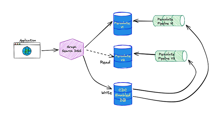
""" Mutation for registering and updating a saved search. They need to be updated any time a user adjusts their search criteria. """ upsertSavedSearch(input: UpsertSavedSearchInput!): UpsertSavedSearchPayload Supporting percolator fields fundamentally changed how we provision the indexing pipelines for Graph Search (see Architecture section of How Netflix Content Engineering makes a federated graph searchable). Rather than having a single indexing pipeline per Graph Search index we now have two: one to index documents and one to index saved searches to a percolate index. We chose to add percolator fields to a separate index in order to tune performance for the two types of queries separately.
Elasticsearch requires the percolate index to have a mapping that matches the structure of the queries it stores and therefore must match the mapping of the document index. Index templates define mappings that are applied when creating new indices. By using the index_patterns functionality of index templates, we’re able to share the mapping for the document index between the two. index_patterns also gives us an easy way to add a percolator field to every percolate index we create.
Example of document index mapping
Index pattern — application_*
{ "order": 1, "index_patterns": ["application_*"], "mappings": { "properties": { "movieTitle": { "type": "keyword" }, "isArchived": { "type": "boolean" } } } Example of percolate index mappings
{ "application_v1_percolate": { "mappings": { "_doc": { "properties": { "movieTitle": { "type": "keyword" }, "isArchived": { "type": "boolean" }, "percolate_query": { "type": "percolator" } } } } } } Percolate Indexing Pipeline The percolate index isn’t as simple as taking the input from the GraphQL mutation, translating it to an Elasticsearch query, and indexing it. Versioning, which we’ll talk more about shortly, reared its ugly head and made things a bit more complicated. Here is the way the percolate indexing pipeline is set up.
See Data Mesh — A Data Movement and Processing Platform @ Netflix to learn more about Data Mesh. When SavedSearches are modified, we store them in our CockroachDB, and the source connector for the Cockroach database emits CDC events. A single table is shared for the storage of all SavedSearches, so the next step is filtering down to just those that are for *this* index using a filter processor. As previously mentioned, what is stored in the database is our custom Graph Search filter DSL, which is not the same as the Elasticsearch DSL, so we cannot directly index the event to the percolate index. Instead, we issue a mutation to the Graph Search DGS. The Graph Search DGS translates the DSL to an Elasticsearch query. Then we index the Elasticsearch query as a percolate field in the appropriate percolate index. The success or failure of the indexing of the SavedSearch is returned. On failure, the SavedSearch events are sent to a Dead Letter Queue (DLQ) that can be used to address any failures, such as fields referenced in the search query being removed from the index. Now a bit on versioning to explain why the above is necessary. Imagine we’ve started tagging movies that have animals. If we want users to be able to create views of “movies with animals”, we need to add this new field to the existing search index to flag movies as such. However, the mapping in the current index doesn’t include it, so we can’t filter on it. To solve for this we have index versions.
Dalia & Forrest from the series Baby Animal Cam When a change is made to an index definition that necessitates a new mapping, like when we add the animal tag, Graph Search creates a new version of the Elasticsearch index and a new pipeline to populate it. This new pipeline reads from a log-compacted Kafka topic in Data Mesh — this is how we can reindex the entire corpus without asking the data sources to resend all the old events. The new pipeline and the old pipeline run side by side, until the new pipeline has processed the backlog, at which point Graph Search cuts over to the version using Elasticsearch index aliases.
Creating a new index for our documents means we also need to create a new percolate index for our queries so they can have consistent index mappings. This new percolate index also needs to be backfilled when we change versions. This is why the pipeline works the way it does — we can again utilize the log compacted topics in Data Mesh to reindex the corpus of SavedSearches when we spin up a new percolate indexing pipeline.
We persist the user provided filter DSL to the database rather than immediately translating it to Elasticsearch query language. This enables us to make changes or fixes when we translate the saved search DSL to an Elasticsearch query . We can deploy those changes by creating a new version of the index as the bootstrapping process will re-translate every saved search. Another Use Case We hoped reverse search functionality would eventually be useful for other engineering teams. We were approached almost immediately with a problem that reverse searching could solve.
The way you make a movie can be very different based on the type of movie it is. One movie might go through a set of phases that are not applicable to another, or might need to schedule certain events that another movie doesn’t require. Instead of manually configuring the workflow for a movie based on its classifications, we should be able to define the means of classifying movies and use that to automatically assign them to workflows. But determining the classification of a movie is challenging: you could define these movie classifications based on genre alone, like “Action” or “Comedy”, but you likely require more complex definitions. Maybe it’s defined by the genre, region, format, language, or some nuanced combination thereof. The Movie Matching service provides a way to classify a movie based on any combination of matching criteria. Under the hood, the matching criteria are stored as reverse searches, and to determine which criteria a movie matches against, the movie’s document is submitted to the reverse search endpoint.
In short, reverse search is powering an externalized criteria matcher. It’s being used for movie criteria now, but since every Graph Search index is now reverse-search capable, any index could use this pattern.
A Possible Future: Subscriptions Reverse searches also look like a promising foundation for creating more responsive UIs. Rather than fetching results once as a query, the search results could be provided via a GraphQL subscription. These subscriptions could be associated with a SavedSearch and, as index changes come in, reverse search can be used to determine when to update the set of keys returned by the subscription.
Imagine a delicious pizza as your complex project. To understand how feature slicing works, let’s break it down slice by slice: easy to manage and delicious (to maintain)! 🍕
I will repeat what I said in my previous medium stories. This will be a long (because why not 😇) and maybe a little difficult to understand article. But once you read it and understand it perfectly, you will now be a10x frontend developer. 😎 Let’s take your coffee. ☕️ If you don’t drink enough coffee, it will take you longer to become a 10x developer. 😅
I like to simplify web and mobile applications by dividing them into smaller parts called feature sets. Each feature set has its own user interface, business logic, and data layer, making it easier to handle. This method, calledFeature-Sliced Design (FSD), shares advantages with component-based approaches. What stands out to me aboutFSDis its ability to break down web and mobile applications into more manageable pieces, especially focusing on user-centric features.
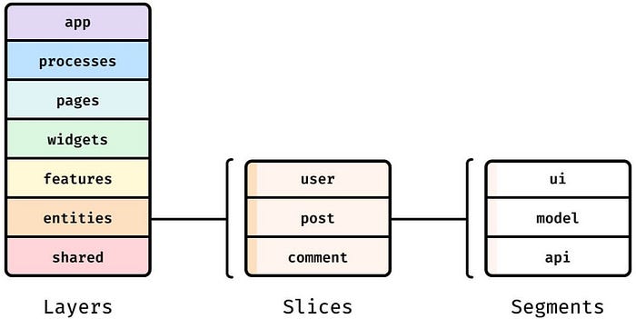
Structure
FSD methodology is built onthreeabstraction levels:layers, slices, and segments.
Layers and Slices
Imagine your app as a deliciouspizza. 🍕 (As a developer working atDomino’s, it is my natural right to use the pizza analogy. 😎)
1. Shared Layer (The Pantry):
Ingredients for everyone:Holds reusable components, utilities, hooks, and services that multiple slices can access. (Think of it as the shared kitchen where everyone can grab common ingredients and tools.)
Examples: -Common UI elements likebuttons,forms,modalsandnavigation bars(think of them as pre-cut veggies and cheese) -Utility functions for data formatting or validation (like a sharp pizza cutter) -Global state management solutions like Redux, Zustand, Tanstack Query (the recipe book for consistency)
2. Processes Layer (The Kitchen Staff):
The hardworking chefs:Handles background tasks and data fetching, keeping the pizza kitchen running smoothly. (Think of them as the pizza chefs who prepare the dough, sauce, and toppings, and coordinate the baking process.)
Examples: -Fetching pizza orders from the online system -Sending notifications when pizzas are ready -Syncing data with the delivery drivers
3. Features Layer (The Pizza Slices):
Independent and self-contained:Each slice encapsulates a specific feature, with its own UI, logic, and data, like individual pizza slices with their toppings.
Examples: - “Order Pizza” slice:Handles pizza selection, customization, and checkout (pepperoni, mushrooms, extra cheese,sucuk-sausage- you name it!) - “Track Order” slice:Displays order status and estimated delivery time (like a pizza tracker) - “Review Pizza” slice:Allows customers to rate and comment on their experience (a feedback form for the chef)
4. App Layer (The Pizza Chef):
The head chef:Oversees the entire pizza-making operation, deciding which slices to bake and how to present them to customers. (Think of it as the master chef who designs the menu, creates new recipes, and ensures each pizza is cooked to perfection.)
5. Pages Layer (The Pizza Display):
Arranges the slices:Composes slices into meaningful page layouts, like arranging pizza slices on a platter or delivery carton box.
Examples: - Homepage:Combines “Featured Pizzas” and “Order History” slices - My Account:Includes “Personal Information” and “Order Preferences” slices
6. Widgets Layer (The Spices):
Optional flavor enhancers:Small, reusable UI components that can be sprinkled across slices or pages/screens, like adding extra seasoning to your pizza.
Examples: -Search bar (for finding your favorite pizza quickly) - User notification panel (alerting you when your pizza is ready) - Modal dialogs (for special requests or confirmations)
5. Entities Layer (The Raw Ingredients):
Building blocks of data:Represents core business entities, like the flour, yeast, and toppings in a pizza.
Examples: -User entity (storing customer details) - Pizza entity (defining pizza types and ingredients) - Order entity (tracking order information)
Key points to remember:
Each layer has a clear responsibility and dependency direction.
Slices can communicate with each other using well-defined contracts, like pizza slices sharing a common crust.
The goal is to create modular, independent, and easily testable slices, making your “pizza” codebase more manageable and delicious!
Additional pizza analogy notes:
The kitchen staff (processes)work behind the scenes, preparing ingredients and ensuring a smooth pizza-making process.
The pizza chef (app)is the mastermind, orchestrating the creation of different pizzas (features) and deciding how to serve them up (pages).
The raw ingredients (entities)are essential for any pizza, but they’re not always visible to the customer — they’re the foundation that makes everything else possible.
Segments (The Toppings):
The ingredients within a slice:While a slice is a complete feature, it’s often made up of smaller parts, called segments. These are like the individual toppings that make up a pizza slice.
Focused on specific tasks:Each segment has a clear responsibility within its slice, like handling a particular UI element, data operation, or piece of logic.
Examples:
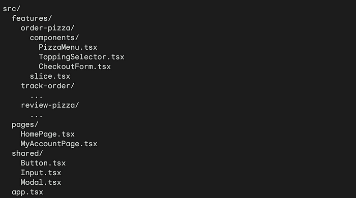
Within the “Order Pizza” slice: - “Pizza Menu” segment:Displays available pizza options and prices. - “Topping Selector” segment:Allows customers to choose their desired toppings. - “Checkout Form” segment:Collects payment and delivery information.
With a more React way:
Each slice is split into one or more of the following segments:
ui/:User Interface components and UI related logic
config/:Local configuration (constants, enums, meta information)
api/:Logic of API requests (api instances, requests, etc.)
Key points to remember:
Slices are larger, self-contained features, while segments are smaller, focused parts within a slice.
Each slice can have multiple segments, just like a pizza slice can have various toppings.
The goal is to create well-organized, modular code that’s easy to understand, develop, and maintain — like making a pizza with beautifully arranged toppings, each adding its unique flavor to the whole pie!
How about exemplifying what we have read so far in code?
1. Folder Structure (The Pizza Kitchen Organization):
// features/order-pizza/components/PizzaMenu.tsx
import React from 'react';

interface PizzaMenuProps {
  // ... pizza options
}

const PizzaMenu: React.FC<PizzaMenuProps> = ({ /* ...props */ }) => {
  // ... fetch pizza options and display them

  return (
    <ul>
      {/* List of pizza options */}
    </ul>
  );
};

export default PizzaMenu;
4. Homepage (The Pizza Display Counter):
Feature-Sliced Design (FSD)is like slicing that pizza into neat, individual pieces, each with its own toppings and flavor. Here’s thegoodandnot-so-goodof this approach:
Clear folder structure:Each slice has its own folder, keeping its components and logic organized.
Independent slices:Each slice can be developed and tested independently, like a self-contained pizza.
Reusable components:Shared components (buttons, inputs, etc.) can be used across slices for consistency and efficiency.
Composition within pages:Pages combine slices to create meaningful layouts, like arranging pizza slices on a platter.
Remember:This is a simplified example. Real-world FSD involves more complex state management, data fetching, and communication between slices. However, this example demonstrates the core principles of organizing React apps using FSD.
The good stuff (slices):🍕
Easy to manage:Like separate pizza slices, each feature is self-contained, making code easier to understand, fix, and update. No more domino effect when changing one part!
Scales like crazy:Need more features? Just add more slices! FSD lets your app grow gracefully, adapting to new needs like adding pepperoni to your veggie delight.
Faster cooking (development):Different teams can work on separate slices at the same time, speeding up development like having multiple chefs making pizzas.
Clear ownership:Each slice has a designated “pizzaiolo,” making developers responsible for its quality and performance, similar to how each chef takes pride in their creation.
Testing made simple:Testing becomes like checking each slice for doneness, making it more focused and efficient.
The not-so-good stuff (crusts):👎🏻
Trickier planning:Slices need to work together seamlessly, like ensuring the cheese doesn’t spill over when joining them. Careful planning and communication are key to avoiding a pizza mess.
Learning curve:Newcomers might be initially confused by the distributed nature of the “pizza,” like figuring out where to find the pineapple chunks. Good documentation is essential to help them navigate.
Extra effort for teamwork:Ensuring communication and smooth connections between slices takes time and attention, like coordinating the chefs to build the perfect pizza together.
Potential redundancy:Sometimes, two slices might have similar ingredients, like having both mozzarella and ricotta. Careful planning and shared resources can help avoid unnecessary duplication.
Limited tools:FSD is still relatively new, so finding tools specifically designed for it might be like searching for a pizza cutter shaped like a unicorn. It might require some extra effort at first.
The decision:
FSDis like a great strategy for large and complex apps, but it’s not a one-size-fits-all recipe. Consider your project’s size, team, and development environment before diving in. Remember, even the most delicious pizza can be tricky to make if you don’t have the right skills and ingredients!
When working with UI in Flutter, there are often cases where you need to measure the size of widgets that have variable sizes depending on their child widgets. Let’s take the example of an OTT streaming app.
In the movie detail page, the plot section shows both text and images. If this area exceeds a certain height, a ‘More’ button appears, partially hiding the content. Pressing ‘More’ reveals the rest of the content.
This plot section does not have a fixed size. Rather, its height varies dynamically based on the amount of text data, device width, and image height. Therefore, to implement such a UI structure, it’s necessary to measure the rendered height of the widget and conditionally set up UI elements like the ‘more’ button and the hidden content based on whether it exceeds a certain height.
So, how can we measure the dynamic size of widgets? In this post, we’ll explore step-by-step how to measure the variable size of widgets through a simple example. Additionally, we’ll delve into the following concepts, addressing Flutter’s rendering process.
WidgetTree, ElementTree, RenderTree BuildContext RenderObject addPostFrameCallback NotificationListener Implementation Goals Let’s briefly examine the example we’ll cover in the post.
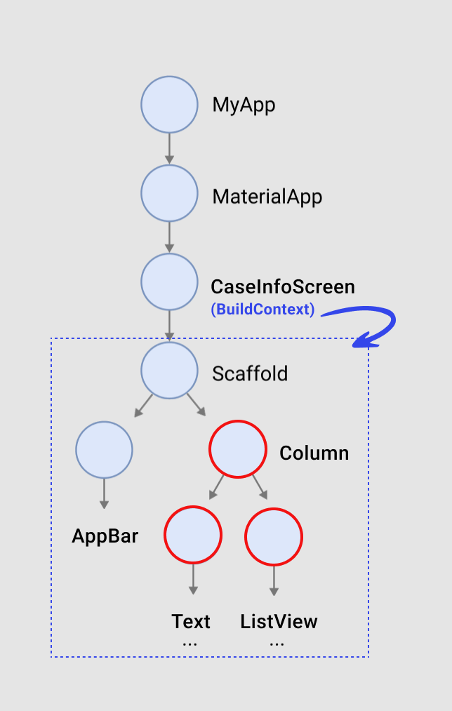
The above screenshot depicts a simple page displaying information about movie cast members. It consists of a Text widget for the title section and a ListView widget with ExpansionTile displaying information about the cast members, all wrapped inside a Column. The Text widget for the title section shows the current height of the Column.
class CastInfoPage extends StatelessWidget { const CastInfoPage({super.key});@override Widget build(BuildContext context) { return Scaffold( backgroundColor: const Color(0xFF000000), appBar: AppBar( leading: const Icon( Icons.arrow_back_ios, color: Colors.white, ), titleSpacing: 0, backgroundColor: Colors.black, centerTitle: false, title: Text( 'Dune: Part Two', style: AppTextStyle.headline1, ), ), body: SafeArea( child: SingleChildScrollView( padding: const EdgeInsets.symmetric(horizontal: 16) + const EdgeInsets.only(top: 20), child: Column( crossAxisAlignment: CrossAxisAlignment.start, children: [ Text( 'Height : ${0}', style: PretendardTextStyle.bold( size: 24, height: 37, letterSpacing: -0.2, ), ), const SizedBox(height: 10), ListView.separated( physics: const NeverScrollableScrollPhysics(), padding: EdgeInsets.zero, shrinkWrap: true, itemCount: CastModel.castList.length, separatorBuilder: (_, __) => const SizedBox(height: 8), itemBuilder: (context, index) { final item = CastModel.castList[index]; return ExpansionTile( tilePadding: EdgeInsets.zero, title: Row( children: [ ClipRRect( borderRadius: BorderRadius.circular(56 / 2), child: CachedNetworkImage( height: 56, width: 56, imageUrl: item.imgUrl, fit: BoxFit.cover, ), ), const SizedBox(width: 10), Column( crossAxisAlignment: CrossAxisAlignment.start, children: [ Text( item.name, style: AppTextStyle.title1, ), Text( item.role, style: AppTextStyle.body3.copyWith( color: AppColor.gray02, ), ) ], ), ], ), children: <Widget>[ Text( item.description, style: AppTextStyle.body3, ), ], ); }, ) ], ), ), ), ); } } When you click on the ExpansionTile, the widget expands to show detailed information about the cast members. Therefore, the size of the widget changes, requiring adjustment of the height value accordingly. We can summarize the following requirements.
- Must be able to obtain the precise size of the currently rendered widget. - Should be able to access the value in the measuring widget to handle UI conditionally. - Must detect changes in widget size dynamically and obtain the changed size (not expandable size). - Should be easy and convenient to use. You can check out the implemented example through the following site.
measure_size_implementation A new Flutter project. measure-size-builder-example.netlify.app
How are Widgets Drawn? First, let’s take a look at how widgets are drawn on the screen in Flutter.
You’ve probably heard about the concept that Flutter creates widgets based on a 3 Tree Architecture consisting of Widget, Element, and Render. You may not be very familiar with encountering objects of elements or render trees during Flutter development, as it's not very common. However, understanding the basic concepts of Flutter's widget tree structure can be very helpful when direct manipulation or access to element or render objects is required, as in this example. So, let's try to explain it in a way that's easier to understand.
Widget Tree — Blueprint of a Car class Lamborghini extends StatelessWidget { const Lamborigini({super.key}); @override Widget build(BuildContext context) { return Car( paint: RedPaint(), engine: 4LV8Engine(), wheel: RimsAltaneroShinyBlack(), carbon : UpperExteriorCarbon(), ... ); } } To help understand the three tree structures of widgets, let’s use the analogy of building a Lamborghini. To build a car, various components such as color, engine, etc., need to be determined. In the above code, we’re passing necessary options to the Car class within the build method.
This process is similar to creating a blueprint for the car, defining how the car’s components are structured and shaped. StatelessWidget or StatefulWidget always override the build method and return a widget inside. These codes are returned as a widget tree and internally create the necessary 'element' through createElement().
Key Point! The code inside the build method is returned as a 'widget tree' and creates an 'element tree'.
Element Tree — Car Parts and Engineers The element tree generated from the widget tree is comprised of elements that are part of widgets and are responsible for managing widget lifecycle and state changes. While the widget tree contains structural information about the code written by developers, the element tree consists of pieces of widgets created based on the widget tree.
If the widget tree is likened to a blueprint of a car, the element in the element tree can be compared to both the car parts and the engineer managing those parts. Just as a car engineer arranges and manages necessary parts according to the blueprint, the element tree creates elements that are parts of the UI needed for the final rendering of widgets and communicates any changes to the render tree as necessary. Now, let's take a closer look at the characteristics of elements.
Widgets are Immutable, Elements are Mutable All Flutter widgets are immutable, meaning their content cannot be modified during runtime. This is similar to a car not being able to suddenly transform into a motorcycle. However, elements are mutable, allowing widgets to be changed as needed. In other words, elements can be removed and replaced with new elements.
Role of BuildContext The BuildContext, which we always pass as an argument when executing the build method in StatelessWidget or StatefulWidget, is used when direct manipulation or access to the Element object is required. It also indicates where the Element created from the widget tree is positioned in the tree. It's like an engineer (BuildContext) examining the blueprint (Widget Tree) to determine where the necessary parts (Element) are and arranging them accordingly.
showDialog<void>( context: context, builder: (BuildContext context) { return AlertDialog(...); }, ); Similarly, when displaying a popup using methods like showDialog, we always need to pass the BuildContext because we need to know which widget (screen) in the composed tree the dialog should appear on.
Key Point! - The element tree manages the widget’s lifecycle and communicates changes to the render tree as needed. - BuildContext is used to determine the position of widgets currently displayed on the screen and plays an important role in manipulating or accessing elements. -BuildContext is also considered as an Element.
Rendering Tree — Car Manufacturing, Manufactured Car
Once the necessary elements are created, the widget finally creates a Render Tree. It's used to handle the actual rendering via the widget's createRenderObject method, which creates a RenderObject, an object that manages the widget's size and layout information. During this process, the RenderObjectElement, created from the Element Tree, becomes directly involved.
The rendering tree can be likened to the manufacturing of a car using car parts. It completes the car using the components manufactured from the Element Tree.
In the rendering tree, two main methods, layout and paint, are used to actually render the widgets we see. During the layout phase, parent nodes pass constraints to child nodes, and at the lowest level, the final size information is passed back up to determine where and how widgets should be drawn. Then, the paint operation is performed, passing the work to the GPU thread to finally complete the widgets.
Key Point!
What If it Wasn’t Composed of Three Widget Trees?
Now that you have some understanding of the architecture of the widget tree, you can clearly understand the reason why widgets are composed of three widget trees. If you were to replace a wheel on a car, you wouldn’t need to rebuild the entire car from scratch. You’d simply replace the existing wheel with a new one. Flutter operates on a similar principle. When parts of a rendered widget need to change based on state, the corresponding element detects this and communicates the changes to the render tree, allowing only the necessary parts to be re-rendered.
However, if Flutter’s widget tree were composed of only one tree, even widgets that didn’t need to change based on state would be redrawn, leading to inefficiencies. It would be like building a new car every time you change a wheel.
In summary, the fundamental reason Flutter’s widgets are composed of three tree structures is to efficiently re-render only the necessary parts of the screen when changes are needed based on state.
1. Separating Widget Trees and Accessing Render Objects via BuildContext Now, let’s go through step by step how to derive the size of widgets with variable sizes depending on their child widgets.
As mentioned earlier, the rendered size of a widget exists in the render tree within a RenderObject, and to access this object, we need a BuildContext. Therefore, the formula is established that with just a BuildContext, we can access the rendered size of a widget.
Size size = context.size!; With this code, we can check the rendered size of a widget accessible via the BuildContext.
However, there is one problem in the current example code’s widget tree.
We want to obtain the rendered size of the Column widget through its associated RenderObject. However, the BuildContext that can access the RenderObject is located higher up at the CaseInfoScreen level. This means that if we proceed like this, we’ll end up measuring not only the size of the Column but also the size of the AppBar, which is a child widget of the Scaffold.
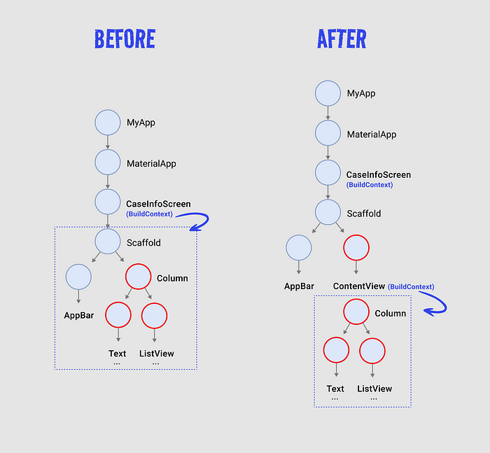
To solve this issue, there are various methods, but the simplest approach is to separate the widget whose size you want to measure, like a StatelessWidget or StatefulWidget. By doing this, a new sub-widget tree is created where the BuildContext is directly accessible through the build(BuildContext context) method of the separated widget. This is commonly referred to as "separating the BuildContext."
class ContentView extends StatefulWidget { const ContentView({Key? key});
class _ContentViewState extends State<ContentView> { double renderedHeight; // <-- Rendered height of the [ContentView] widget
@override void initState() { super.initState(); /// Accessing the rendered size of the widget via [BuildContext] /// and assigning it to the renderedHeight variable renderedHeight = context.size?.height ?? 0; }
@override Widget build(BuildContext context) { return Column( crossAxisAlignment: CrossAxisAlignment.start, children: [ Text( 'Height : ${renderedHeight}', // <- Displaying the rendered height in a Text widget ), ... ], ); } } Now, as shown in the above code, by separating the widget we want to measure into a separate StatefulWidget, we can obtain the rendered height of the desired widget by accessing the size value through the BuildContext within the new build method.
NOTE If you don’t separate it into a separate widget, using GlobalKey to find the RenderObject can also be a good approach.
2. Obtaining Size When Widget Rendering is Complete However, running the above code will result in the following runtime error:
======== Exception caught by widgets library ======================================================= The following assertion was thrown building Builder(dirty): Cannot get size during build. Why does this error occur?
As explained earlier, in the render tree, the layout method is responsible for passing constraints from parent nodes to child nodes and determining the final size information from the bottom node to the top node to decide where and how the widget should be drawn. The problem arises because an attempt is made to access the size value before the layout method is executed.
To address this issue, Flutter provides the addPostFrameCallback method. This method is used to register a callback that is invoked after the widget has been painted on the screen. In other words, it's a callback method that is executed after the rendering tree operations are completed.
WidgetsBinding.instance!.addPostFrameCallback((_) { setState(() { renderedHeight = context.size!.height; }); }); Inside the addPostFrameCallback callback method, as shown in the code above, you can assign the rendering height of the widget accessed through the BuildContext to the renderedHeight variable. This way, by accessing the rendering size value through the context only after the widget has been rendered, you can assign a value to the renderedHeight variable without encountering any errors.
3. Detecting and Obtaining Size When Widget Size Dynamically Changes While most of the requirements have been met, there’s one remaining functionality: detecting when the widget’s size changes due to user interaction and displaying the updated size on the screen.
When the ExpansionListTile widget on the screen is clicked, the widget expands, changing its size. However, the current code does not detect the size change and update the value.
To address this, we can use a widget called NotificationListener, which is useful for detecting and handling notifications (such as size changes, scrolling, gestures, etc.) that occur within the widget tree.
NotificationListener( onNotification: (_) { if(renderedHeight != context.size!.height) { setState(() { renderedHeight = context.size!.height; log('height : $renderedHeight'); }); } return true; }, child: Column(...) ) Wrap the existing Column widget with a NotificationListener widget. Inside the onNotification callback, add logic to detect the size change of the widget and update its size accordingly. In the provided code, the setState method is used to update the changed size.
NOTE Since NotificationListener can receive events like scrolling or touch gestures, which could lead to unnecessary updates if the size remains the same, the update logic is placed within the condition if(renderedHeight != context.size!.height).
By adding this code, the widget’s height changes are detected, and the size is updated accordingly. However, a new issue arises: continuous execution of the onNotification callback whenever the widget's size changes.
[log] height : 367.0 [log] height : 367.0 [log] height : 369.3854225873947 [log] height : 375.8518112897873 [log] height : 385.81551444530487 [log] height : 435.25 [log] height : 413.13516367971897 [log] height : 430.28125 [log] height : 448.9247215986252 [log] height : 469.3435592651367 [log] height : 491.38857555389404 [log] height : 551.9744523763657 [log] height : 540.0271100997925 [log] height : 567.0 The onNotification callback is repeatedly executed whenever the widget's size changes, leading to multiple unnecessary calls to the setState method. This could potentially impact performance and needs to be addressed.
To solve this issue, we can implement a debouncer logic. A debouncer delays consecutive calls for a certain period and executes the action only after the last call.
/// Deboucner Module class Debouncer { final Duration delay; Timer? _timer;
Widget build(BuildContext context) { return NotificationListener( onNotification: (_) { debouncer.run(() { // <-- Apply Debouncer Callback if(renderedHeight != context.size!.height) { setState(() { renderedHeight = context.size!.height; log('height : $renderedHeight'); }); } }); return true; }, child: Column(...) ... } In the provided code, a Debouncer class is declared, and within the onNotification callback, the debouncer is used to delay consecutive calls to the setState method. This ensures that the setState method is only called after the widget's size has stopped changing, optimizing performance.
4. Modularizing for Ease of Use Since the functionality of obtaining the rendering size of a variable widget can be applied to different screens or multiple projects, modularizing it for easy use is a good idea.
Therefore, I created a custom widget called MeasureSizeBuilder. This widget encompasses all the logic discussed earlier, and it is designed to allow access to the rendering size of the specified widget through the builder property, which returns the widget whose size needs to be measured. The size can be accessed through the size property within the builder.
Now, let’s take a look at the completed example code.
Finally, we have fulfilled all the requirements we set out to achieve 🎉
I have published the measure_size_builder package used in the example. For those interested in this feature or modularized code, please refer to the following link.
measure_size_builder | Flutter package Simplest way to get dynamic size of widget pub.dev
‘지금 내 뇌는 정상적인 상태가 아니다. 그러니 심호흡 한번하고 지금 상황을 다시 생각해보자’라고 말이에요. 이후 기분이 나쁠 만한(?) 일들이 몇차례 있었지만 이러한 대책(?) 덕분인지 아직까지 화를 내지는 않고 있습니다.
이제는 나아가 가족에게도 화를 내지 않는 법을 고민하고 있습니다. 물론 아이들에게 몇차례 화를 냈지만 그 빈도를 줄이려 노력하고 있어요.
가족처럼 가까운 사람에게 화를 자주 내는 이유에 대해서는 여러 해석이 있는데요,가깝기 때문에 유대 관계가 끊어지지 않을 것이라는 믿음때문이라는(기사)해석도 있습니다. 뇌가 가까운 사람,즉 가족과 나를 동일시하기 때문이라도 설명도 있고요(동영상).
이유야 어찌 됐건, 이 역시 자주 끓어오르는 감정적인 뇌를 억누르다 보면 화내는 빈도를 줄일 수 있지 않을까요.
GPT-4o 의 등장으로 AI 기업들의 발걸음이 분주해진 상황에서 잠시 뜨거운 뇌를 식힐 겸, ‘화’에 대해 다루어 봤습니다.
화가 나는 원인, 그때 뇌에서 발생하는 일을 알게 됐고, 화를 억누르는 방법도 알았으니오늘 점심은 ‘나를 가장 미치게 만드는 사람’과 함께 해보는 것은 어떨까요.한마디를 할 때 마다 심호흡해야 할 수 있지만 이런 사람을 대상으로 화를 억누르는 테스트에 성공한다면 우리의 직장 생활도 조금은 나아지지 않을까요...
북극 지도는 종류도 엄청나고 제공하는 정보도 놀랍다. 조용한 방에서 집중해서 지도를 들여다보며 지도가 주는 정보들을 소화할 수 있다면, 누구라도 북극의 마르코 폴로가 될 것이다.
- 배리 로페즈의 《북극을 꿈꾸다》 중에서 -
* 예전에는 각 가정마다 지구본이 있었습니다. 아이들은 지구본을 돌려 보며 세계 여러 나라를 머리에 그리며 꿈을 키웠습니다. 저도 큼지막한 지구본을 '고도원의 숲속 서점'인 '하비책방' 한 켠에 놓아두고 많은 사람들이 한 번씩 돌려보게 하고 있습니다. 낯선 국가와 도시를 짚어보며 꿈을 키우다 보면 언젠가 실제로 북극의 마르코 폴로가 되어 있을 것입니다.